We’ve worked with a bunch of UI libraries on our eLearning projects. Through trial and error, we’ve found the one that works best for us.
We ended up using Chakra UI. We love it so much that this article can seem like an ad. Well, it isn’t. I’m just sharing our experience with several UI libraries.
Anyway, the library that fits us may not be perfect for you. This article will help you choose a UI library that suits your needs. Here we go.
UI libraries Vs CSS solutions
First off, let’s work out the difference between UI component libraries and other CSS solutions.
UI libraries are made of components that developers build applications with. Essentially, components are prewritten chunks of code. They include styles, classes, and also logic that ties everything together.
Developers use components like building blocks. The libraries are meant to save time for the devs. This way, software vendors can focus on the business needs of the client rather than on technical details, like how to build an adaptive progress bar.
CSS tools like frameworks and preprocessors also speed up the developer’s work. Tools such as TailwindCSS, SASS, or LESS include styles and classes, just like component libraries.
The main difference is that they don’t have logical elements. CSS tools make it easy to build custom components, but they don’t come with ready-made solutions.
Now let’s put together UI libraries and CSS tools to see how they compare.
What library to stick with?
As we’ve figured out that UI libraries suit us better than CSS frameworks and other tools, here comes the next question. Which library should we use? We ended up with Chakra for our eLearning projects.
But your needs may be different from ours. That’s why we’ll cover the pros and cons of each component library we’ve tried. You’ll see which one works for you.
Ant design
We worked with Ant Design when we were building our eLearning platform. Here’s what we’ve noticed about it.
Pros
- TypeScript friendly;
- Tons of components. You can build a comprehensive service using just the components from the library;
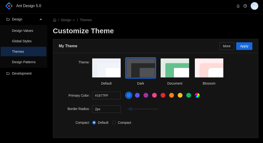
- Powerful theme customization. They’ve got anything you can think of, like Right-to-left script, internationalization, dark mode, and so on;
- Great documentation with many examples.

Cons
- Mobile. Antd is not optimized to work on mobile out-of-the-box. You can still pair Antd with Ant Design Mobile, though. So this wasn’t a huge issue for us.
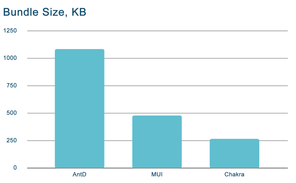
- Huge bundle size. The component library is rich, but this can also come around as a disadvantage. The bundle size is 1.2MB. It’s worth it if you’re working on a huge project, but for small to midsize projects, this library can be an overkill. The components are slow.
- Styling. Technically, you can style the components. But here’s the twist:
- You can only customize themes via ‘less’ files
- Some components are riddled with bugs.
- Sometimes you may be forced to override styling with !important
- Antd overrides some global styles. At the moment, you can’t enforce the global styles, and have to stick with the overrides.
Poor accessibility. Remember I mentioned that most UI libraries are accessible? Well, antd is not so much. For example, a Lighthouse accessibility review scores the page with Select components at 55/100. They still need to work on the WAI-ARIA compatibility.

Material UI
MUI is a React component library that implements Google’s Material Design. Fun fact: MUI isn’t a Google product, but a crowdfunded open-source library.
Pros
- Great UI. The components are based on Material Design, and the design is very consistent. If you love Google Material, this is the library for you.
- Huge community. MUI is one of the most popular React libraries out there, so you can reach out for help and solve your issue quickly.
- Simple to use (at first). If you use the components out of the box, they are very neat and great to use.
- TypeScript friendly.
Cons
- Lack of customization. MUI adds lots of classes to every HTML tag, which makes it difficult to customize the components. It took us hours to build our own design system with MUI.
- Bundle size. It’s twice as small as Antd, but it is still 490 KB when minified. We needed something smaller.
- Low performance. As with Ant Design, MUI is slow. We’ve noticed that websites render very slowly, because they render excessive DOM nodes. We’ve also had issues with specific components, like buttons and inputs. It is not bug-free.

Chakra
It’s a modern component library for React web apps. You can reuse or compose your own components with Chakra.
Pros
- Customization. The other libraries I’ve mentioned today focus on ready-made components that aren’t supposed to twist much. With Chakra, the idea is that you can compose your own ones. Thanks to the styled system you can style your props or change the component behavior. Also, most components support dark mode and RTL.
- TypeScript support. Chakra is built on 97.5% TypeScript, so it supports TypeScript out of the box. As you can tell by now, this is an important point for us. All the UI libraries we’ve tried were TypeScript friendly, and this is especially so.
- Accessibility. This is another big point for Chakra. The library is fully compatible with WAI-ARIA and a11y. Navigation and proper outlines are all covered to make sure that everyone can access your service.
Cons
- Fewer components. Chakra misses a few complex core components like powerful tables, date pickers, menu select, and graphic visualization. You’d either have to write those yourself or use a third-party library.
- Not perfect styling. Yes, Chakra is more customizable than the other two libraries. But it is still a UI library and not a framework. You can’t style components like the switch, alert, checkbox, and some others.
- Bad for huge projects. Such projects are performance-sensitive with frequent data updates. If you use Chakra components there, you’ll notice that the performance will drop.
Chakra is perfect for small to midsize datasets, though.

Conclusion
This is what we’ve noticed about UI libraries.
Comprehensive libraries with many components tend to be:
- Harder to customize;
- Slower.
Generally, there is a balance between performance, customization and the speed of work. You can only pick 2.
Also, some libraries are better at accessibility or i11n than others. On eLearning projects, this is important.
We found a sweet spot with Chakra UI. It’s not as detailed and extensive as Ant Design or MUI, so the performance of our products is great. And it is still much faster to work with than a CSS framework.
If you want to build a service with out-of-the-box components, MUI or AntD might be your choice.
If you value full customization, you can stay away from any library and choose a CSS framework instead.

Think about where you fit on the spectrum, and choose wisely.


