Building staff insights dashboards for a state education agency
Our team helped a US-based education agency improve access to and visualization of critical staff-related data for public schools across one of American states. The goal was to make information on hiring, certification, and employment trends easier to understand and use, especially by local education agencies and decision-makers.
Key achievements

| 100% | visualization coverage of available educator workforce data in the state system |
| 10 GB | of text data processed |
Project scope
When we joined the project, the customer already had a significant amount of employee data collected and stored in Snowflake. However, the data wasn’t yet suitable for analysis or decision-making. It was raw, inconsistent, and difficult to interpret.
Our job was to clean it up, organize it, and turn it into something people could actually use. To get there, we followed a step-by-step approach:
Step 1. Data preparation and transformation
We started by cleaning and organizing the existing data. Using DBT, we filtered out irrelevant details, fixed inconsistencies, and aligned formats, making the data more reliable for analysis.
Step 2. Building data marts
Then, we grouped the cleaned data into smaller, topic-focused sets called data marts. These covered areas like hiring trends, tenure, and certification, making access and analysis much easier.
Step 3. Creating dashboards
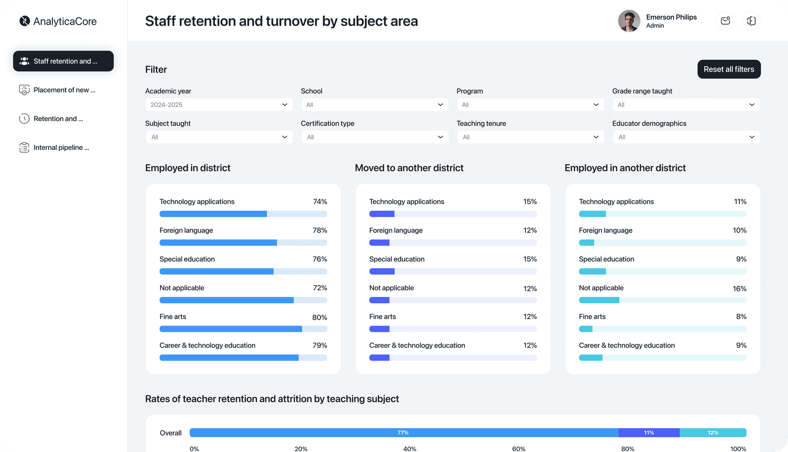
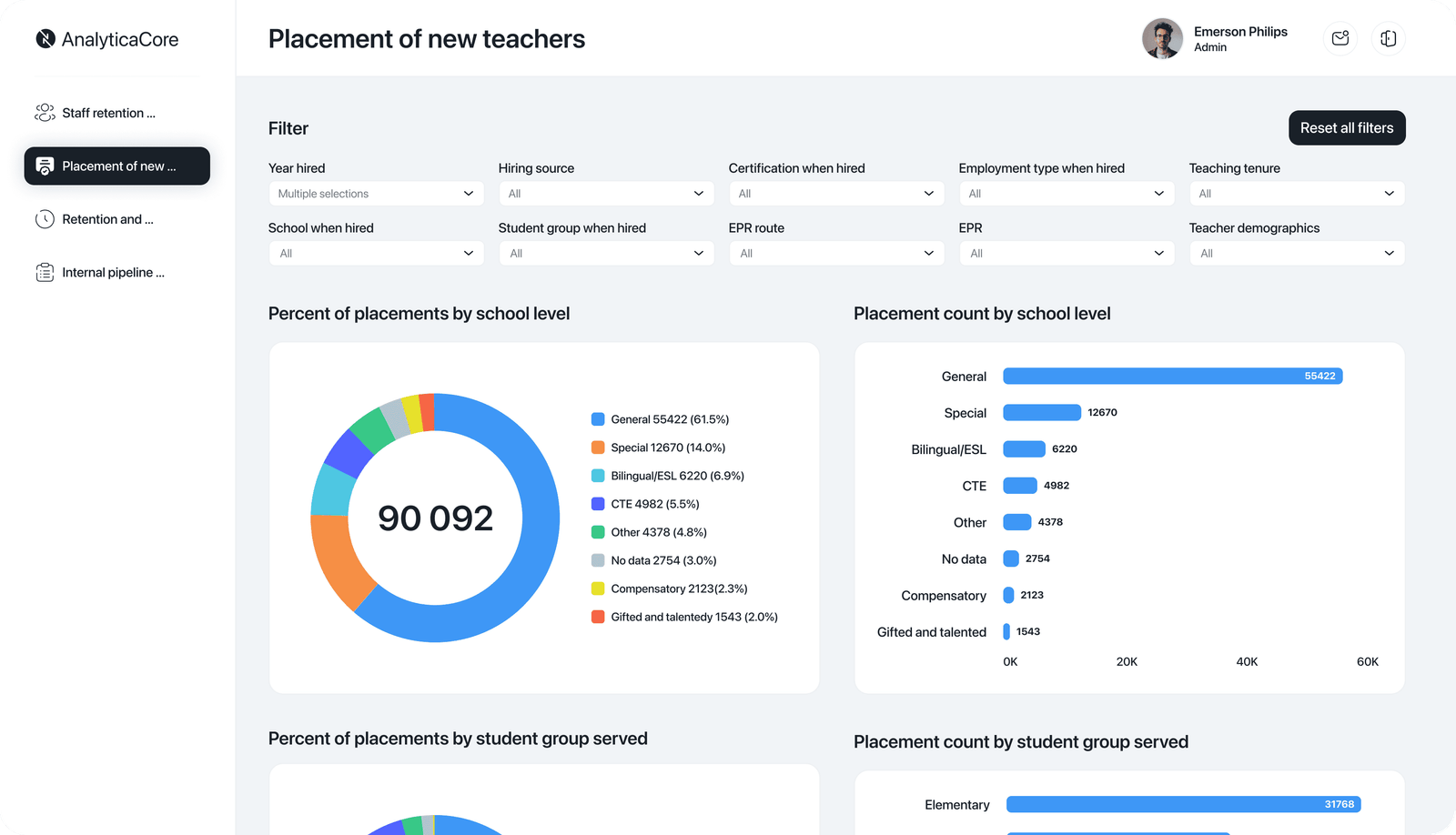
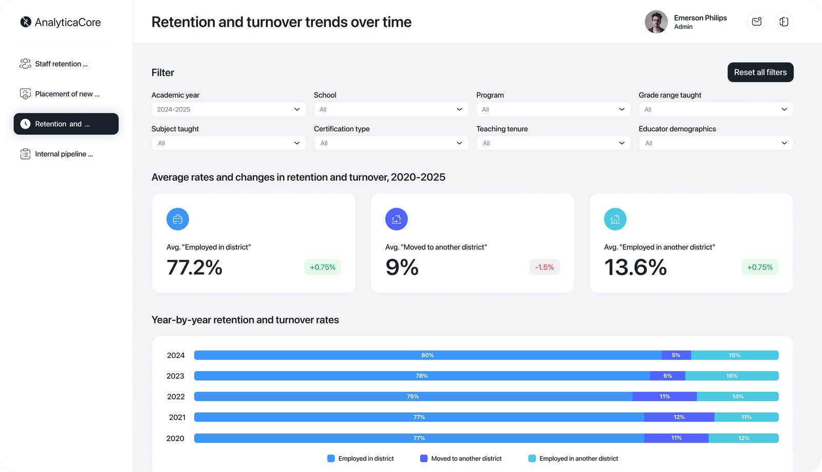
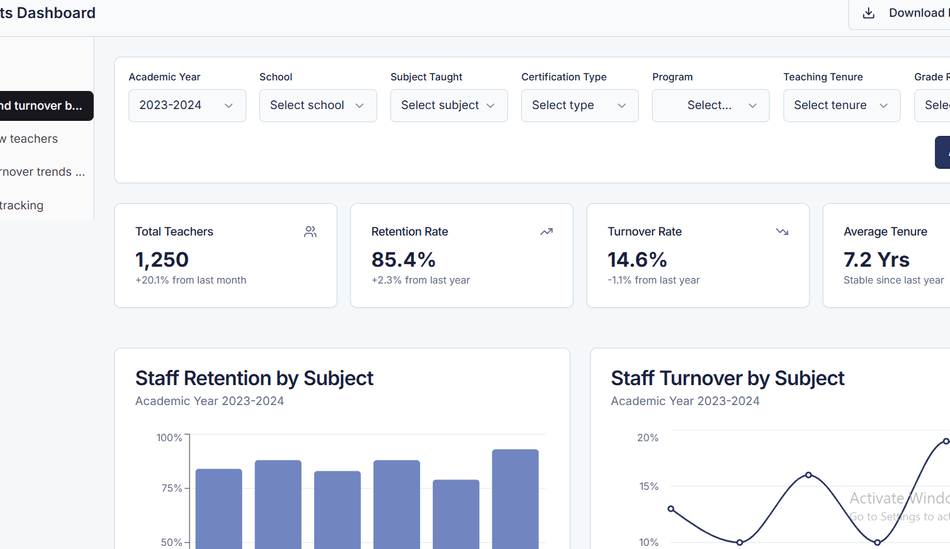
Next, we built interactive dashboards in Power BI. With graphs, charts, and filters, they gave users a clear view of workforce metrics, like retention rates, shortages, and certification levels.
Step 4. Integrating dashboards into local systems
To make access seamless, we embedded the dashboards into local web portals. This way, district teams could get insights right from the tools they already use.
Tools and technologies
Do you want a solution like that?
Or do you have another idea and need a tech partner to implement it? Aristek is here to help.


