Introduction
To begin with, accessibility in education means that information becomes easily available for all types of students.
Accessible education enables students with special needs to develop the same skills and attain the same level of knowledge as their peers.
In the past, students with learning difficulties were usually sent to special classes separately from their classmates.
By increasing access to education, we allow these students to study in the same classrooms as their peers, with all the educational, emotional and social benefits that inclusion brings.
The current view is that this method of inclusive education is much more useful than separation, both for addressing learning problems and for teaching students who face these problems.
The requirements for accessible education are constantly changing. As learning methods for change and technology evolve, accessibility tactics must also evolve.
In the field of K–12 education, there is an increasing demand for accessible design, which is regarded as a sign of outstanding design.
Accessible design in K-12 education refers to the creation of learning environments and materials that can be easily approached and used by all students, including those with special needs.
3 reasons to use it
1. It guarantees that all students can easily access learning materials and take part in class activities, regardless of their skills, backgrounds, or preferred learning styles.
2. Designing courses that focus on accessibility and inclusion
allows instructors to create a more attentive and equitable learning environment for all students.
This leads to improved student success and narrows gaps in learning outcomes.
3. What’s more, teachers should consider how course design can affect access to materials and technology.
This is because students with different backgrounds or with limited access to technology resources may face barriers when trying to access learning content.
By following this approach, teachers can promote greater equity and accessibility in education for all students.
Benefits of accessible design
- Students can interact with curricula and materials and express their reactions to them according to their own preferences.
- The variety of perceptions of materials can be a source of intrinsic motivation for each student.
- Online courses provide access to all learning materials for everyone regardless of their abilities and capabilities.
- Information is presented in a variety of ways and formats so that students can choose the most appropriate way of assimilating knowledge.
Which problems does accessible design tackle?
Here’s a list of pitfalls that can be solved thanks to an accessible design approach.
- User-unfriendliness
The level of accessibility improves the usability of a website or application. Features such as clear navigation and intuitive design benefit all users, promote satisfaction, and make it easier to interact with products and services.
- Minimal user base
When your platform becomes available, it attracts a wider audience of users because people with a variety of backgrounds and usage options can utilize it. This helps expand the reach and customer base of your product.
- Distracting or outdated user interface
Activating additional functionality in your designs will improve the user experience, including both those with feature limitations and those without. This will make interaction with your platform more convenient and accessible to all.
- Analyzing different platforms is not in favor of educational platforms
Students compare the apps and platforms they see in the classroom not only to similar products at school, but also to non-educational apps and platforms that often seem more interesting in comparison.
- Lack of inclusivity
Accessibility promotes a more inclusive society and prevents discrimination against people with special needs. Everyone deserves equal opportunities to access information, services and social goods.
How does accessible design deal with these problems?
These are 5 ways to ensure successful troubleshooting.
Accessibility Guidelines Compliance
Our actions are based on the guidelines presented in the WCAG (Web Content Accessibility Guidelines) standard. These guidelines include comprehensive instructions for creating accessible digital content.
Thoughtful Color Selection
We pay attention to selecting color schemes with sufficient contrast to ensure usability for people with color blindness or limited vision. To ensure compliance with these requirements, we also use special tools to verify color schemes.
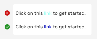
In the first sentence, the highlighted word (link) contrasts poorly with the rest of the sentence. Compare it with the second sentence, where the word “link” is perfectly contrasted and highlighted to add emphasis.
Creating Inclusive Forms
We create user-friendly forms. Also include clear labels, instructions, and error messages. We make sure users can navigate and fill out forms without relying solely on the computer mouse.
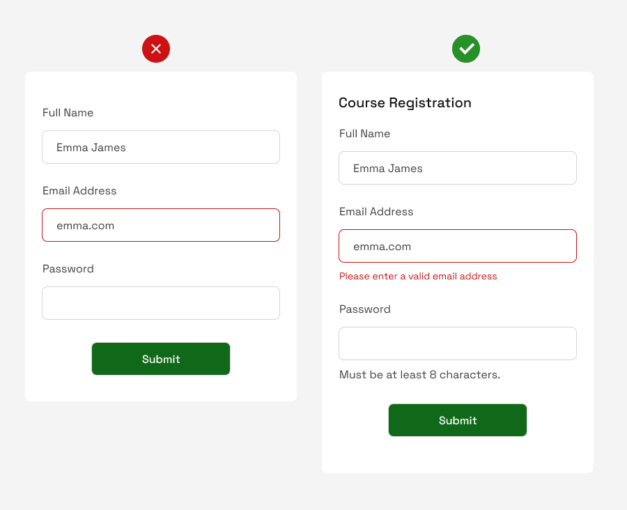
Problems & Solutions to Them
❌ The left form has no title (to indicate what the form is for).
✅ A header was added indicating that the form is for ” Course Registration”.
❌ It shows an error field without explaining what it means.
✅ An error field specifically explains what happened: the user entered an incorrect email address.
❌ The form doesn’t specify the number of characters the password should have, all of which is very helpful to the user(s).
✅ The number of password characters required by the platform was specified.
Implementing Adaptive Design
Implementing adaptive design will allow your projects to easily adapt to different screens, ensuring that they meet the needs of users across different devices.
This is an effective way to increase the accessibility of your projects.
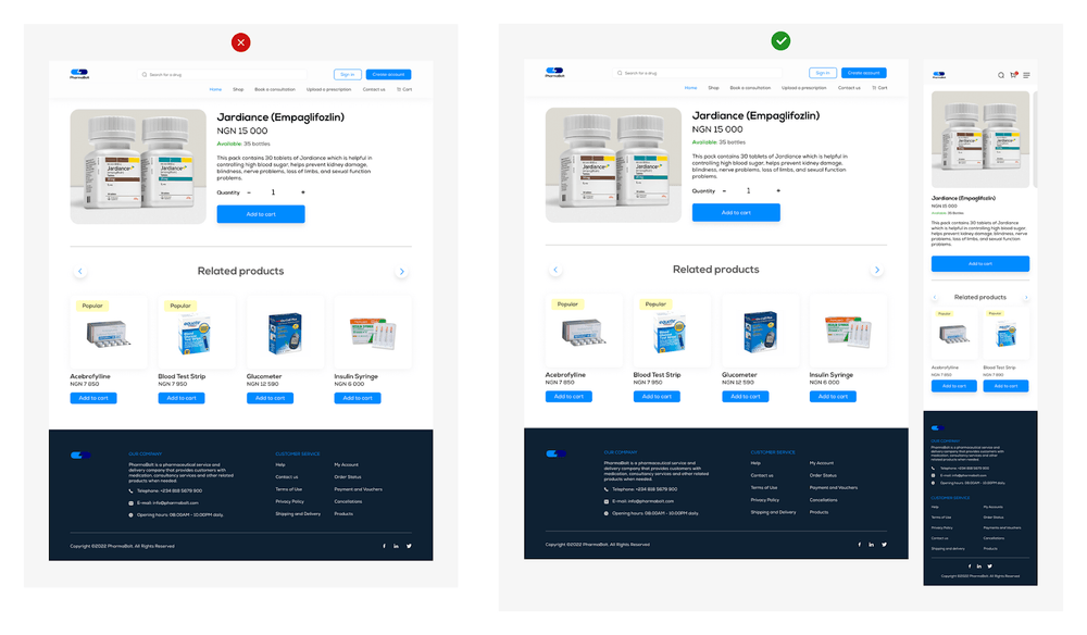
This is an example of a product description page on a website.
The first image on the left shows only the desktop version. In the second image, the design is more accessible – you can also see the mobile adaptive version.
Creating a project for a variety of screen sizes confirms that your design will be suitable for an audience using different devices, as mentioned earlier.
Feedback & Error Correction
We strive to ensure that our projects provide meaningful feedback and handle bugs correctly.
This is essential to providing an outstanding user experience. Improper handling of error notifications can significantly degrade the user experience, so it is important to provide adequate feedback to make our designs more accessible and satisfactory.
We use a variety of approaches to make our designs accessible.
One such method is to create an accessibility checklist that helps us navigate the design process and monitor accessibility compliance.
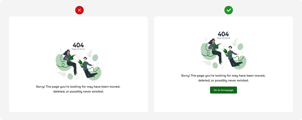
In the example above, the first 404 page tells the user what error has occurred and what may be the cause, but does not offer a way to fix it.
On the other hand, the second page 404 explains the error and suggests a way to fix it – “Go to homepage”.
Conclusion
For more successful development of educational applications and platforms we are moving to a student-oriented model, where the emphasis is shifted from teachers to the students themselves.
In this context, our application developers pay much more attention to meeting the needs, habits and goals of users.
To meet these needs and goals, companies are actively engaging with key user groups, including students, teachers and parents of young users, to take their point of view into account when developing products.
This trend gives users more influence on product design and is critical to ensuring that applications effectively meet the needs of their users.
